Friday, August 22, 2014

Design on the Water

Design doesn't have to exist solely on dry land.  There are plenty of opportunities that lie right in the water.  Houseboats, house barges and floating homes are becoming increasingly popular and come with many unique options for design, both interior and exterior.

Houseboats of one form or another have been around for years in many different parts of the world.  In Amsterdam there are houseboat hotels, Hong Kong has its' own floating village, and Lake Union in Seattle is home to a large community of floating homes or float house neighborhoods.  There are some differences between the types of homes found on the water and their primary use.  Houseboats refer to a boat that has been transformed to be used primarily as a home; a float house is actually a house that is on a float or a raft; and a house barge is a home built on a barge that can be towed.

Here is a peek at a houseboat project that we at Donna DuFresne Design were able to be a part of...


In Portland there are an abundance of both houseboats and float homes along the Willamette and Columbia Rivers.  Here are a few of our favorites.


Have you ever thought of moving onto the water?  Let us know your thoughts!

Wednesday, July 2, 2014

Wild for Wallpaper

When some people think about wallpaper it brings to mind a stuffy, outdated, floral print.  This isn't your grandmother's wallpaper anymore though.  Wallpaper has come back into fashion in a big way.  It is a great addition to any room that you want to make a statement in.

Wallpaper dates back to before the 1700s.  It was originally designed to mimic the large tapestries that the wealthy would hang on their walls for decoration and insulation.  Those with less money turned to hanging large sheets of paper that were painted with designs to brighten up their rooms.

Hand Painted Chinese Wallpaper c. 1780

Here is a recent project from Donna DuFresne Design.  This bathroom needed an update and wallpaper was a great option to add a bold new look.  You can see how simply adding wallpaper instead of repainting gave the space quite a dramatic change.

Before

After

Here are some examples of current wallpaper options that we love.


Have you used wallpaper recently in a project?  Please share your experience with us!

Wednesday, May 14, 2014

Tile as Artwork

There are so many options for gorgeous tile these days that it doesn't need to serve only a functional purpose.  Tile can be used as artwork in rooms like kitchens and bathrooms.  Since most tile is fairly durable and moisture resilient it is a great option for spaces that get a lot of use.

Here, at Donna DuFresne Design, we recently completed a tile project for a client's master bathroom.  The wood in the bathroom was beautiful and she wanted to keep it while updating both the style and function of the room.  One of the main issues was that there was no shower; only a bath.


Before


Since there really wasn't room for a dedicated shower, making the space into a wet room was a clear choice.  The client loved the idea and several tile options were selected for the featured wall.


The client chose to go with the Grigio Wave tile and then Quarziti 2.0 Glacier from Oregon Tile & Marble was picked to compliment that.  A shower was installed along the back feature wall and towel hooks were added.  While the Foliage tile would have looked great, the Grigio Wave really brightens things up.  Here is the finished product!


After


If you are looking for some local places to get amazing tile here are a few of our favorites.


402 NW 9th Ave
Portland, OR 97209


1845 SE 3rd Ave.
Portland, OR 97214


1201 SE 3rd Ave.
Portland, OR 97214

Check out any of these showrooms to find a new artistic tile for your home!

Thursday, February 27, 2014

Wellness & Design

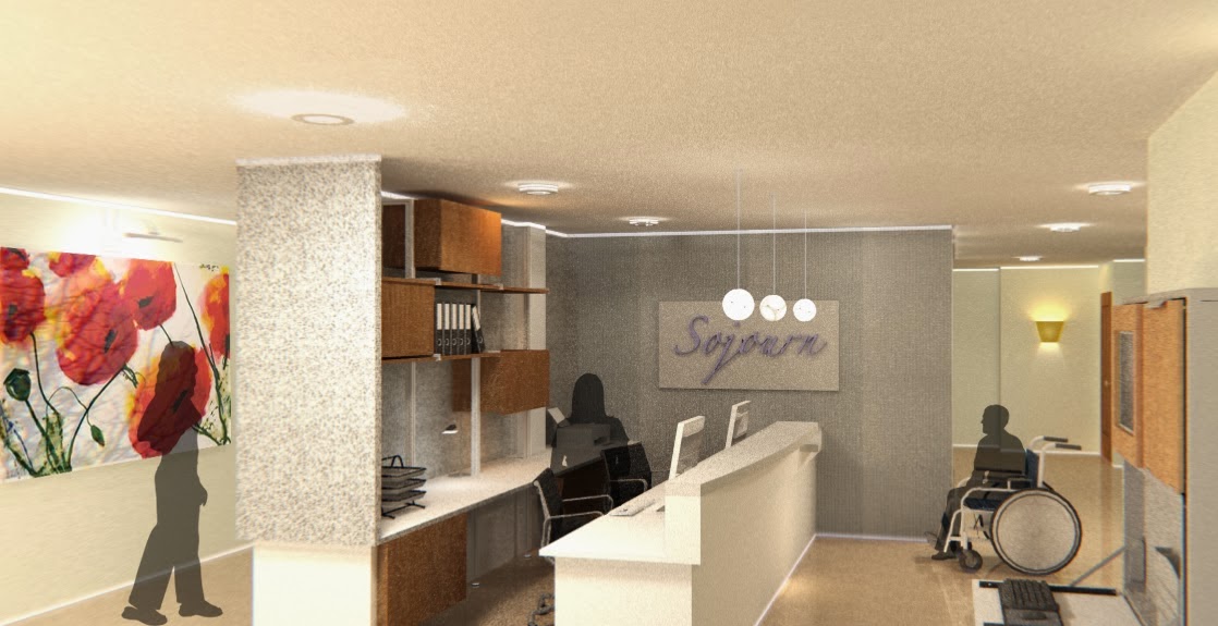
It's easy to think of interior design as a frivolous expense, but when healthcare is considered, it becomes apparent the key role good design can play.  It can help shorten healing time, improve overall mood, and increase ease and comfortability.  These are just a few reasons why well thought out design in the healthcare field can make such a difference.  When most people think of where they would like to be when they are sick a typical hospital rarely comes to mind.  Most have been designed simply for efficiency and lack many of the finishing touches that make a space hospitable, but this shouldn't be the case.

During the last snowstorm, we had an emergency visit to Randall Children's Hospital at Legacy Emanuel for an appendectomy and we were wowed!  It showed just how amazing a hospital can be.  The team at ZGF truly kept the end user in mind during their thoughtful approach to a space for those who need comfort the most.  Not only is it an inviting space, but sustainability played a large role during the whole process.  From experience, it was hard to get our young patient to even want to leave.

"A cramped, outdated hospital wing was transformed into a new, 334,000 square-foot, nine-story building dedicated to pediatric care.  The building features single-patient rooms, large windows that bring natural light into rooms and corridors, unique family and social spaces, and access to stunning outdoor gardens - all design elements that studies have shown can improve the health of patients and enhance the quality of care provided."  - Nathalie Weinstein


My Design Associate, Katherine O'Brien, also used a similar concept for her senior thesis.  The project focused on creating a space that the patient is happy to be in and able to heal more quickly.  Another key point was to make sure that friends and family of a patient would want to visit.  Finally, making sure that form did not outweigh function, the space was designed so that the workers could easily do their job in a space they could enjoy.  The space featured single patient rooms, two apartment-style suites for family who might accompany the patient, a gym, gardens, and much more.


We can only hope that future healthcare facilities take their patients and staff into consideration and continue to make more spaces like these.

Do you have an experience with good or bad design that influenced your well-being?  Let us know!

Wednesday, December 11, 2013

Ainsworth Holiday Home Tour

This year is the 26th Annual Ainsworth Holiday Home Tour and we at Donna DuFresne Design are excited to be a part of this special event.  One of our clients has a stunning Colonial Revival in the Heights and just happens to be one of the stops on the tour.  So, Donna DuFresne Design and Bloke teamed up to give this lovely home a festive make over!  To learn more about the Ainsworth Holiday Home Tour and how it benefits the children and their school, follow this link.

"The oldest home on the tour, this 1911 Colonial Revival is also one of the most historically intact. Walking through the house, you will get a true sense of the features found in finer residences of the era: the original (still operable) intercom system, dust chutes on every floor, servants' staircase, original light fixtures, steam radiators, a laundry chute, secret panels, sinks and fireplaces in the bedrooms, custom shaped windows and screens, and plentiful built-ins. While retaining all of these elements, the home has been decorated with tasteful elegance that honors tradition, yet infuses it with 21st century style."


Photo courtesy of Ainsworth Holiday of Homes Tour

We wanted to share some photos showing how all the hard work paid off.  Although, we would strongly recommend taking a look in person because the photos just don't do it justice!


What is your favorite part about decorating for the holidays?  We'd love to hear your stories!

Tuesday, December 3, 2013

Moving On Up

Moving is something everyone has to do and most don't enjoy.  Here are some tips from an interior design perspective that can help make getting into the new space more of a pleasure than a pain.  We at Donna DuFresne Design, along with Bernadette Breu Experience, just found out that we will be moving come February 2014.  This is a daunting and exciting task, so we figured we would share some insight into the process.  Make sure to keep connected to find out where the move takes us!

Scout Out Your New Space

Make sure that the area that your are moving to is a good one for all of the right reasons.  Is there access to all of the places you will frequent the most?  Or from a business perspective, will your clientele be able to frequent your space?  This can be a very frustrating time because finding the right space in the right place isn't easy.  Once you find the perfect spot look it over it thoroughly.  This is a great time to make a list of ideas, problems, needs, etc.  Request a floor plan, or if you're able to, sketch one yourself.  This is also actually a perfect chance to get your interior designer involved or hire one to help.  They can assist you with finding solutions to problems that you might not have thought of.  An interior designer can suggest which things to keep and what new things may possibly work in the space.  It's nice to get them involved early so the road ahead can be mapped out more easily.


Go Through Things & Decide What To Keep

Either with the help of your interior designer or on your own, try to brainstorm possibilities of where current things will go.  If you can, make space plans so that you can have an idea of where things will be placed as they are being moved in.  It makes the move much less work and way less stressful.  If there are possessions that you can't part with, but may not work in the new space, make arrangements for where they will be kept.  Having items in the way that aren't being used makes moving much more difficult.  This is a great time to get rid of things that aren't necessary; purging unused things can feel really good.


Decide If There Are Improvements/Changes To Be Made

If you haven't already contacted an interior designer this is where it really counts.  It's harder to make improvements or changes once everything is in place.  An interior designer can come up with solutions for remodeling and/or make suggestions for additions, like paint, wallpaper, flooring, fixtures etc.  Find some inspiration images of spaces that really speak to you.  Think about ways that these inspirations can be worked into the new place and try to utilize pieces you already own.  Refinishing or recovering existing pieces can help them fit into the new design.

Moving In

Please don't force things to fit where they don't belong.  Usually, this just ends up as a disappointment and necessitates being reworked later.  Also, don't be afraid to leave spaces unfinished until you can do it in the right way.  Take time in the space and don't rush finding new things all at once, it's tempting, but slow down and think about it.  Going shopping with an interior designer can really help you find creative solutions!

Reflect

Once some time has passed look back at how the whole process turned out and think about what went right and wrong.  Are there things that could have been done better to keep stress levels down?  Since most people will have to move more than once it's good to be able to have a better game plan for next time.  Move smarter and not harder!  (P.S. Some of these tips can also be useful if you're remodeling the space you already have.)


We would love to hear any tips or tricks that you have found especially helpful while moving.  Please share!